
What Counts as a Viral Tweet? 22x Your Own Median Post
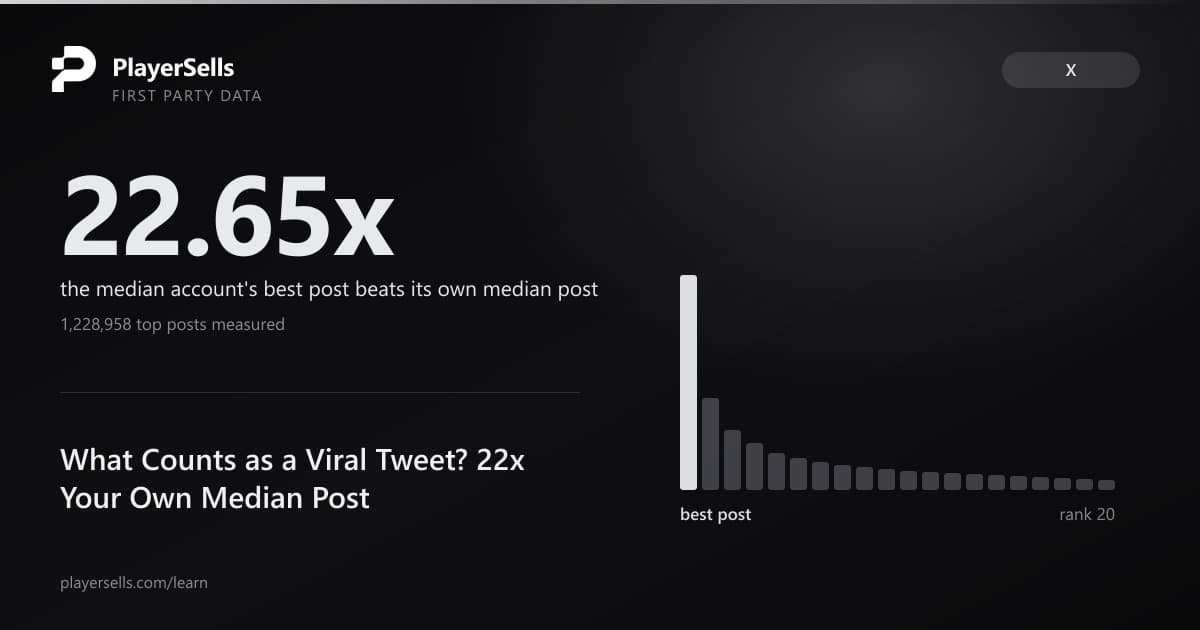
What counts as a viral tweet? We joined 1,228,958 stored top posts to 41,187 account baselines: the median best post scores 22.65x its own median.
The median X account in our engagement index has one post that earns 22.651 times the engagement of its own ordinary post. We measured that on 2026-08-29 across 41,187 accounts by joining each account's stored best post to that same account's 30-day baseline, and the tail is worse than the middle: at the 90th percentile the best post scores 744.884 times the median post, and at the 99th percentile it scores 27,170.490 times. The mean of the whole distribution is 1,351.128, roughly sixty times its own median, which is the clearest possible sign that averages are useless here.
Anyone deciding whether to buy an X account is usually looking at a screenshot of one post. Our data says that screenshot is the least representative artifact the account has ever produced, and that the more impressive it looks the less it tells you. Accounts whose best post scored between 100,000 and 999,999 engagements have a typical post at 1,311 engagements. Accounts whose best post cleared 1,000,000 have a typical post at 1,848. The screenshot got roughly nine times larger and the account behind it got 1.4 times better.
Our engine stores the top 20 posts of 70,210 X accounts, 1,228,958 posts in total, captured between 2026-08-19 and 2026-08-29. Separately we compute a 30-day performance baseline for 46,815 accounts covering median likes, median views, median engagement, engagement rate, authenticity and consistency. Joining the two tables on account id is what makes this article possible, and 45,563 accounts sit in both. Asking what counts as a viral tweet in the abstract produces a threshold; asking it against the account that posted it produces a number you can price. Everything below is about the distance between those two numbers, because that distance is exactly what a highlight reel is designed to hide.
How much better is a typical account's best tweet than its median tweet?
The median account's best stored post earns 22.651 times its own median post, measured across 41,187 accounts. We computed the ratio by taking each account's rank-one stored post, dividing its engagement by that same account's median engagement over the preceding 30 days, and then taking percentiles across accounts rather than across posts. Every account contributes exactly one number to the distribution, so no single explosive account can distort it. Engagement here means likes plus reposts plus replies plus quotes, the same definition on both sides of the ratio.
| Percentile of accounts | Best post as a multiple of the account's own median post |
|---|---|
| 10th | 2.896x |
| 25th | 6.750x |
| 50th (median) | 22.651x |
| 75th | 112.284x |
| 90th | 744.884x |
| 95th | 2,725.437x |
| 99th | 27,170.490x |
| Mean (not a percentile) | 1,351.128x |
n = 41,187 accounts, each present in both our stored top-post table and our 30-day engagement baseline table, with a non-zero median engagement. Baselines were computed between 2026-08-17 and 2026-08-29.
The distance between the mean and the median is itself the finding. A mean of 1,351.128 against a median of 22.651 means the average is set by a handful of accounts with one freak post, so any benchmark that reports an average multiple is describing those accounts and not yours. Every other figure in this article is a median computed with a proper percentile function, and the mean above appears once, labelled, purely to show why we refuse to use means anywhere else.
One objection to the headline deserves a direct test rather than a caveat. Our baseline covers the last 30 days while a stored best post can be years old, so part of the 22.651x could simply be an account that used to be larger. We split the same 41,187 accounts by whether the peak post falls inside the same 30-day window as the baseline it is being compared against, and the gap survives the split.
| Cohort | Accounts | 25th | Median | 75th | 90th | 99th |
|---|---|---|---|---|---|---|
| Peak post inside the 30-day baseline window | 21,955 | 5.400x | 16.750x | 70.349x | 375.955x | 12,377.788x |
| Peak post older than the baseline window | 19,232 | 8.922x | 32.866x | 187.502x | 1,370.950x | 46,561.045x |
n = 41,187 accounts split into the two cohorts above. The like-for-like row compares a peak and a baseline drawn from the same 30 days.
Reading the split carefully matters more than the headline does. When the best post and the baseline come from the same 30 days, the median account still peaks at 16.750 times its own typical post. When the peak predates the baseline window, the median rises to 32.866 times. The 16.750x figure is the honest floor for the highlight-reel effect, and the difference between the two rows is what an aged peak adds on top. A screenshot alone does not tell you which of those two situations you are in, which is precisely the problem this article exists to quantify.
What counts as a viral tweet if you measure it against the account that posted it?
What counts as a viral tweet has no platform definition, so every circulating threshold is somebody's assertion rather than a measurement. We tested the two thresholds that dominate search results against 1,228,958 stored top posts and against the 40,901 accounts where we hold view data on both the peak and the baseline. Both thresholds describe a different population than they claim to describe, and one of them turns out to be commonplace rather than rare.
| Circulating claim | What we measured | Sample |
|---|---|---|
| Viral means 10,000 reposts or 100,000 likes, and under 0.5 percent of tweets qualify | 1.892% of stored top posts clear that bar; 13.78% of accounts have ever produced one | 1,228,958 posts, 70,210 accounts |
| Viral on X is 500,000 to 1,000,000 views in two to three days | 40.34% of accounts have peaked above 500,000 views at least once; 30.10% above 1,000,000 | 40,901 accounts |
| A 30x to 40x spike from your baseline is the meaningful signal | 36.32% of accounts cleared 30x at their peak, 32.34% cleared 40x, and the median account peaks at 12.54x | 40,901 accounts |
| Viral posts spike in impressions compared with the user's average | Confirmed and quantified: median peak 261,586 views against a median typical post of 12,211 views | 40,901 accounts |
n = 1,228,958 stored posts across 70,210 accounts for the first row, and n = 40,901 accounts with non-null view counts on the peak post and a non-zero median view baseline for the other three.
The repost-and-like threshold is the one that fails hardest. Our 1.892 percent was measured on the single most favourable sample that exists: the 20 best posts each account has ever produced. Applied to ordinary posting it would be far rarer still, so the published claim of under 0.5 percent of all tweets is directionally plausible and its practical meaning is not. Only 13.78 percent of the 70,210 accounts we index have ever produced one such post, which makes it a career milestone rather than a benchmark.
The view threshold fails in the opposite direction. Among indexed accounts, 40.34 percent have cleared 500,000 views on a single post at some point, so a number sold as the definition of viral describes something two-fifths of our indexed accounts have already done. That figure carries the heaviest selection warning in this article: accounts enter our index because they are findable and followed, so 40.34 percent is a statement about indexed accounts and would be far lower across X as a whole.
The most useful answer we can give is the shape of a typical peak rather than a threshold. Across 70,210 accounts, the median rank-one post carries 3,823 likes, 479 reposts and 80 replies. The 25th percentile peak carries 322 likes and the 90th percentile peak carries 83,385. So the best post an indexed account has ever managed sits, at the middle of our index, around twenty-six times below the 100,000-like bar that circulates as the definition. Judging a specific account against a fixed threshold discards the only comparison that carries information, which is the account against itself.
How fast does an account's own highlight reel decay?
An account's second-best post earns well under half of what its best post earns, and by the twentieth-best post the account is back at its ordinary output. We measured the decay two ways across the same 1,228,958 stored posts: the raw median engagement at each rank, and the same posts expressed as a multiple of the posting account's own 30-day median. Both readings agree, and the second is the one a buyer can act on.
| Rank within the account's own top 20 | Accounts with this rank stored | Median engagement | Median likes | Accounts with a baseline | Median multiple of the account's own median |
|---|---|---|---|---|---|
| 1 | 70,210 | 5,039 | 3,823 | 41,187 | 22.65x |
| 2 | 68,623 | 1,753 | 1,323 | 40,666 | 9.55x |
| 3 | 67,536 | 991 | 750.5 | 40,179 | 6.26x |
| 5 | 65,646 | 490 | 372 | 39,201 | 3.83x |
| 10 | 61,496 | 192 | 146 | 36,950 | 2.00x |
| 20 | 54,205 | 76 | 58 | 32,750 | 1.01x |
n = 1,228,958 stored posts across 70,210 accounts for the engagement columns. The multiple column uses only accounts that also carry a 30-day baseline, and its own sample size is stated per row.
The twentieth-best post of the median account performs at 1.01 times that account's ordinary post. An entire career-best top 20 therefore collapses back into the baseline within twenty posts, which puts a hard number on how thin a highlight reel really is. Nothing in an account's history sits on a plateau above its own normal output; the elevated region is a spike of one or two posts followed by a steep slide.
The practical consequence for anyone evaluating an account is a cheap and precise substitution. Asking for the fifth-best post instead of the best one cuts the inflation from 22.65 times down to 3.83 times. Asking for the tenth cuts it to 2.00 times. A seller who can produce a strong fifth and tenth post is showing you a genuinely elevated account; a seller who can only produce the peak is showing you one post.
The rank-one-to-rank-two step is the steepest in the whole curve. Median engagement falls from 5,039 to 1,753 between the first and second post, and the multiple falls from 22.65 to 9.55. Two posts into the reel, more than half the apparent performance has already evaporated. Our engine ranks stored posts by engagement, so this ordering is mechanical rather than editorial, which is what makes the shape comparable across all 70,210 accounts.
What share of an account's reach sits in its single best post?
Inside the 20 best posts an account has ever produced, the single best one carries a median 25.59 percent of the engagement, and the top five carry 64.70 percent. We measured that on the 54,154 accounts for which our crawler captured a full set of 20 posts with a non-zero total, so the denominator is identical for every account in the cut. At the 75th percentile the single best post carries 45.76 percent of the top-20 total, and at the 25th percentile it carries 15.42 percent.
One boundary must be stated plainly before those numbers travel. The 25.59 percent is a share of the top 20, not a share of everything the account ever posted. We store winners only, so the true share of lifetime output concentrated in one post is higher than 25.59 percent rather than lower, and we deliberately decline to estimate it. Estimating the unstored remainder would require standing a median in for a mean inside a heavy-tailed distribution, and that error runs in exactly the direction that would flatter this article.
Prior research established the population-level shape without ever turning it into a per-account number. Goel, Anderson, Hofman and Watts, writing in Management Science on roughly one billion diffusion events, reported that over 99 percent of cascades are tiny and terminate within a single generation. Kwak, Lee, Park and Moon noticed the same asymmetry on 41.7 million profiles back in 2010, observing that the median lies almost always below the average. Neither paper answers the buyer's question, which is what one account's peak says about that same account's floor.
| Follower tier | Accounts | Best post share of top-20 engagement | Top five share | Median age of the peak post |
|---|---|---|---|---|
| Under 10,000 | 9,639 | 32.89% | 76.36% | 45.7 days |
| 10,000 to 99,999 | 8,550 | 26.44% | 65.70% | 34.7 days |
| 100,000 to 999,999 | 8,858 | 21.66% | 59.32% | 24.9 days |
| 1,000,000 or more | 7,789 | 20.39% | 56.87% | 26.2 days |
n = 34,836 accounts holding a full stored set of 20 posts and a 30-day baseline. Follower counts are those recorded at the moment each baseline was computed.
Concentration falls steadily as accounts get larger. A sub-10,000-follower account in our sample puts 32.89 percent of its top-20 engagement into one post, while an account above a million puts 20.39 percent there and spreads the rest more evenly. The confound worth naming is selection rather than size: a small account has to be unusual to enter our engagement index at all, so the smallest tier is not a random sample of small accounts and the gradient is a statement about the accounts we index.
The completeness of each stored reel varies, and reporting it keeps the concentration figures honest. Of the 70,210 accounts with any stored top posts, 54,205 (77.20 percent) have a full 20, 7,291 (10.38 percent) have between 10 and 19, 4,150 (5.91 percent) have between 5 and 9, and 4,564 (6.50 percent) have fewer than 5. Every concentration figure above is restricted to the full-20 group so that partial reels cannot inflate a share by shrinking its denominator.
How old is the median account's best post?
The median account's best stored post is 135.0 days old, and 27.47 percent of accounts have a peak post older than two years. We measured post age against 2026-08-29 across all 70,210 accounts with a stored highlight reel, excluding one row dated 1985 that predates Twitter entirely and five more from 2006 and 2007. Stored posts run from 2008 through 2026-08-28, so an account's best moment can belong to a completely different era of the platform.
| Age of the account's single best post | Accounts | Share |
|---|---|---|
| Under 30 days | 21,777 | 31.02% |
| 30 to 89 days | 9,716 | 13.84% |
| 90 to 364 days | 12,311 | 17.53% |
| 1 to 2 years | 7,113 | 10.13% |
| 2 to 5 years | 11,897 | 16.94% |
| Over 5 years | 7,396 | 10.53% |
n = 70,210 accounts, one row each, measured against 2026-08-29. Six rows with impossible or pre-platform timestamps were excluded before bucketing.
More than a third of indexed accounts, 37.60 percent, have a peak post older than a year, and 10.53 percent have one older than five years. A five-year-old peak was earned under a different ranking system, a different reach economy and in many cases a different owner. Valuing an account from a screenshot of that post is valuing an artifact rather than an asset, and nothing on the screenshot itself carries the date in a form most buyers check.
The 135.0-day median is a blend of two populations, and separating them is far more useful than the blend. For accounts where our engine could compute a 30-day baseline, the median peak post is 33.5 days old and only 8.25 percent have a peak older than two years. For accounts where no baseline could be computed, the median peak is 1,046.1 days old and 63.03 percent have a peak older than two years.
| Cohort | Accounts | Median peak age | Peak older than 2 years | Median days since the newest top-20 post | Silent for over a year |
|---|---|---|---|---|---|
| 30-day baseline computed | 45,563 | 33.5 days | 8.25% | 6.3 days | 1.32% |
| No baseline computable | 24,647 | 1,046.1 days | 63.03% | 597.1 days | 62.38% |
n = 70,210 accounts, split by whether our engine could compute a 30-day posting baseline for them during the window 2026-08-17 to 2026-08-29.
Both cohorts have a median of 20 stored posts, so the difference is not a gap in what our crawler managed to capture. Failing to compute a 30-day baseline means the account did not post enough within 30 days for one to exist, and 62.38 percent of those accounts have produced nothing good enough for their own top 20 in over a year. Across all 70,210 accounts, 22.75 percent have not added a top-20 post in over a year and 15.65 percent have not in over two.
That split converts into the single cheapest screen in this article. If a tool cannot compute a recent posting baseline for an account, the absence is the signal, because in our data it is 62.38 percent predictive of an account that has produced nothing notable in a year. Our X algorithm score checker and posting time analyzer both fail in exactly that visible way on dormant accounts, which makes a blank result more informative than a good one.
What does a screenshot of one viral post predict about normal output?
A larger screenshot does predict a better account, and it predicts it far more weakly than its size suggests. We banded 41,187 accounts by the engagement on their single best stored post and read off the median of their own 30-day typical post inside each band. Moving from a best post at 167,221 engagements to a best post at 1,487,925, roughly a ninefold jump in the screenshot, raises the typical post from 1,311 to 1,848.
| Engagement on the best post | Accounts | Median best post | Typical post, 25th | Typical post, median | Typical post, 75th | Median multiple |
|---|---|---|---|---|---|---|
| Under 1,000 | 10,656 | 200 | 5 | 17 | 56 | 7.3x |
| 1,000 to 9,999 | 12,464 | 3,565 | 40 | 155 | 491 | 20.6x |
| 10,000 to 99,999 | 14,320 | 28,694 | 101 | 588 | 2,231 | 47.6x |
| 100,000 to 999,999 | 3,683 | 167,221 | 156 | 1,311 | 6,617 | 142.2x |
| 1,000,000 or more | 64 | 1,487,925 | 162 | 1,848 | 6,637 | 808.5x |
n = 41,187 accounts. The top band holds only 64 accounts and should be read as thin: it clears our minimum reporting threshold of 30 and nothing more.
The quartiles inside each band matter more than the medians do. Among accounts whose best post scored between 10,000 and 99,999, the typical post ranges from 101 at the 25th percentile to 2,231 at the 75th, a twenty-two-fold spread inside a single band. Conditioning on the screenshot narrows the plausible range for an account and comes nowhere near pinning it down, so a screenshot is a prior rather than an answer.
Views tell the same story with a sharper ending, and views are what sellers screenshot most often. Across 40,901 accounts where we hold view data on both sides, the median account peaks at 261,586 views against a typical post at 12,211. The gap between those two numbers is the entire commercial problem: one is the number on the screenshot and the other is what the account will do for its next owner.
| Views on the best post | Accounts | Median peak views | Typical post, 25th | Typical post, median | Typical post, 75th | Median multiple |
|---|---|---|---|---|---|---|
| Under 100,000 | 15,045 | 20,011 | 976 | 3,415 | 10,704 | 3.3x |
| 100,000 to 499,999 | 9,356 | 230,316 | 5,259 | 19,541 | 48,124 | 11.7x |
| 500,000 to 999,999 | 4,188 | 705,492 | 7,544 | 30,538 | 90,107 | 22.8x |
| 1,000,000 to 4,999,999 | 8,025 | 2,029,645 | 6,594 | 35,728 | 121,978 | 59.3x |
| 5,000,000 or more | 4,287 | 10,467,800 | 6,947 | 46,418 | 191,183 | 265.1x |
n = 40,901 accounts with a non-null view count on the peak post and a non-zero 30-day median view baseline. View count is present on 1,061,199 of 1,228,958 stored posts, 86.35 percent.
The bottom quartile column is the one to read across. In the 500,000 to 999,999 band the 25th percentile account has a typical post at 7,544 views; in the 5,000,000-plus band it has one at 6,947 views. A screenshot fifteen times larger buys no improvement at all at the bottom of the band. In every view band above 100,000, a quarter of accounts have a typical post under roughly 7,600 views no matter how large their single peak was.
Comparing the medians across the last three bands makes the same point from the other side. Going from a 705,492-view peak to a 10,467,800-view peak, a jump of roughly fifteen times, lifts the median typical post from 30,538 to 46,418 views, a jump of roughly 1.5 times. The screenshot scales; the account underneath it barely does. Anyone pricing an account from its peak is paying a multiple on the wrong number.
Is one viral tweet evidence that an account performs well?
One viral post is weak evidence about an account's normal output, and it is still roughly twice as informative as the follower count. Across 41,187 accounts we measured a Spearman rank correlation of 0.5805 between the best post and that account's own 30-day median engagement, against 0.2892 between follower count and the same median. On logged values the Pearson correlation between best post and baseline is 0.6056.
A rank correlation of 0.5805 is real and nowhere near determinative. Ordering accounts by their best post produces a meaningfully better guess at their typical output than ordering them by followers, which is the field most marketplace listings lead with. Neither figure is a prediction about any specific account, and neither implies that a viral post causes better ordinary performance: accounts that peak higher also tend to post more and to hold a more responsive audience, and these two tables cannot separate those explanations.
The weakest link in the trio deserves its own sentence. Best post and follower count correlate at only 0.1496 across those same 41,187 accounts, so a large viral post is close to statistically independent of account size in our index. A seller showing a million-view screenshot is not thereby showing you a large account, and a large account is not thereby one that has ever produced a million-view post. Follower count and peak performance are two separate claims that need two separate checks.
Our stored engine field for this ratio validates the whole calculation independently. The engine writes a viral multiple onto 736,613 of 1,228,958 stored posts, 59.94 percent, and at rank one its median is 22.664 across 41,192 posts. Our independently computed 22.651 across 41,187 accounts reproduces that to within 0.06 percent, which is the kind of agreement that tells you a join is doing what you think it is doing.
Does the highlight-reel gap change with follower count?
The gap is U-shaped across follower tiers, at its narrowest for accounts holding between 100,000 and 1,000,000 followers. We measured the best-post multiple across the same 41,187 accounts split into five follower bands, using the follower count recorded at the moment each baseline was computed rather than a current number.
| Follower tier | Accounts | 25th | Median multiple | 75th | 90th |
|---|---|---|---|---|---|
| Under 1,000 | 3,662 | 7.00x | 43.00x | 870.79x | 9,247.35x |
| 1,000 to 9,999 | 8,543 | 7.00x | 32.25x | 255.39x | 2,182.18x |
| 10,000 to 99,999 | 10,579 | 6.37x | 21.89x | 105.31x | 646.85x |
| 100,000 to 999,999 | 10,494 | 5.49x | 14.89x | 52.76x | 209.92x |
| 1,000,000 or more | 7,909 | 9.46x | 26.06x | 92.78x | 321.07x |
n = 41,187 accounts across the five tiers above, each with a stored peak post and a non-zero 30-day median engagement.
Accounts between 100,000 and 999,999 followers are the most predictable group in our index, with a median multiple of 14.89 and a 90th percentile of 209.92. Accounts under 1,000 followers are by far the least predictable at 43.00 and 9,247.35, mostly because a tiny denominator makes the ratio explosive: their median typical post scores 38 engagements, so a single ordinary hit produces an enormous multiple.
The upturn at a million followers, back up to 26.06, is present in our data and we do not have a clean causal account of it. The plausible confound is reach: the very largest accounts push posts well outside their own follower base when something travels, which widens the top of their distribution without moving the bottom. We restricted the same cut to accounts whose peak sits inside the 30-day baseline window and the U shape held, with tier medians of 28.78, 23.32, 14.67, 11.34 and 23.57 across 21,955 accounts, so the shape is not an artifact of old peaks.
For anyone shopping by tier, the operational reading is that mid-size accounts are the ones whose screenshots least mislead. Our sibling analysis of which follower tier to actually buy covers price and supply at each size; this measurement adds the variance dimension, which is that the same screenshot means something more reliable at 300,000 followers than at 800.
Why is the average X engagement rate reported as both 0.03 percent and 2 percent?
Published X engagement rates differ by roughly seventy times because they are computed over different account populations, and we can reproduce the entire spread inside one dataset. Rival IQ publishes a median X engagement rate of 0.029 percent from a panel weighted toward large brand accounts. Buffer publishes 2.15 percent for January 2025 from a set weighted toward individual creators. Neither is wrong and neither is comparable to the other, and the table below is the reason.
| Follower tier | Accounts | Median engagement on a typical post | Median engagement rate |
|---|---|---|---|
| Under 1,000 | 3,662 | 38 | 3.732% |
| 1,000 to 9,999 | 8,543 | 45 | 0.452% |
| 10,000 to 99,999 | 10,579 | 106 | 0.113% |
| 100,000 to 999,999 | 10,494 | 256 | 0.041% |
| 1,000,000 or more | 7,909 | 448 | 0.021% |
n = 41,187 accounts. Engagement rate here is the account's median post engagement divided by its follower count at compute time, expressed as a percentage, which we verified directly against the stored column across 41,098 rows.
Our own engagement rate falls from 3.732 percent for accounts under 1,000 followers to 0.021 percent for accounts above a million. That is roughly a 178-fold spread inside one index, one formula and one measurement window. Any published X engagement benchmark is therefore primarily a statement about which accounts the publisher sampled, and a benchmark quoted without its follower band cannot be compared against a specific account at all.
One property of our figure is worth naming because it is unusual in this field. Our engagement rate is computed on the median post rather than the mean post, which makes it structurally immune to the single outlier this entire article is about. Most published rates average the posts, and averaging a distribution in which one post routinely outperforms the median by hundreds of times produces a number that describes the outlier rather than the account that produced it.
Anyone checking a specific account can reproduce the calculation on their own numbers. Our X engagement rate calculator applies the same median-post formula, and our published engagement benchmarks and index reports carry the percentile tables by size. For the follower-quality side of the same question, our guide to verifying real followers before you buy covers the account-level bands this article deliberately does not restate.
Which account scores predict a flatter output distribution?
Authenticity score predicts the gap and consistency score does not, which is the opposite of what we expected. We measured both against the best-post multiple on accounts that posted at least 20 times inside the 30-day window, because without an activity floor both scores are dominated by accounts that barely posted at all.
| Authenticity score band | Accounts | 25th | Median multiple | 75th | 90th |
|---|---|---|---|---|---|
| 0 to 19 | 4,244 | 10.24x | 41.03x | 249.98x | 2,036.61x |
| 20 to 39 | 4,839 | 11.36x | 46.11x | 273.69x | 1,624.47x |
| 40 to 59 | 4,923 | 10.31x | 33.69x | 141.36x | 593.62x |
| 60 to 79 | 4,958 | 8.67x | 23.27x | 70.81x | 241.66x |
| 80 to 100 | 4,911 | 6.25x | 13.24x | 31.25x | 78.62x |
n = 23,875 accounts carrying an authenticity score, a 30-day baseline and at least 20 posts sampled in the window.
Accounts scoring 80 or above on authenticity have a median best-post multiple of 13.24 and a 90th percentile of 78.62. Accounts scoring under 40 sit at 41.03 and 46.11 with 90th percentiles above 1,600, meaning one in ten of them produced a post more than sixteen hundred times their own median. Authenticity is populated for only 28,131 of the 46,815 accounts in our engagement index, 60.09 percent, so this cut runs on 23,875 accounts after the activity floor and cannot be extended to the whole index.
Consistency score failed the same test, and the failure is instructive enough to publish in full. Without an activity floor, accounts scoring exactly 100 showed a median best-post multiple of 1.87, which would have made an irresistibly clean buying rule. Checking the activity behind the score killed it within one query.
| Consistency score band | Accounts in the index | Median posts sampled in 30 days | Accounts posting under 10 times | Median multiple, no activity floor | Median multiple, 20-post floor |
|---|---|---|---|---|---|
| 0 to 19 | 9,131 | 50 | 290 | 18.64x | 19.03x |
| 20 to 39 | 10,092 | 46 | 624 | 22.38x | 23.59x |
| 40 to 59 | 11,814 | 40 | 1,454 | 17.48x | 18.42x |
| 60 to 79 | 6,129 | 15 | 2,002 | 10.63x | 12.22x |
| 80 to 99 | 402 | 41 | 3 | 11.41x | 12.11x |
| Exactly 100 | 9,247 | 2 | 8,228 | 1.87x | 9.69x |
n = 46,815 accounts for the index columns, 21,955 accounts for the unfiltered multiple and 19,898 accounts for the floored multiple. The exactly-100 band holds 244 accounts once the 20-post floor is applied.
Accounts scoring exactly 100 on consistency posted a median of two times in 30 days, and 8,228 of those 9,247 accounts posted fewer than ten times. An account with two posts is trivially consistent, and its best post is frequently the same post as its median, so the ratio collapses toward one for arithmetic reasons rather than editorial ones. With a 20-post floor the 1.87 becomes 9.69 across 244 accounts.
What survives the floor is not usable as a screen. The three lowest consistency bands hold 17,698 of the 19,898 accounts that clear the floor, and their medians sit flat at 19.03, 23.59 and 18.42. A score that does not separate accounts across the range where nearly all of them sit is not a decision tool, and we would rather publish that than dress it up. Authenticity, by contrast, separates cleanly, and our follower authenticity audit is the tool that computes it for a named account.
Does a highlight reel drawn from one month mean anything?
For 21.51 percent of accounts, all 20 stored best posts fall inside a single 30-day span, and for 6.61 percent they fall inside a single week. We measured the span across 54,204 accounts holding a full set of 20 posts. A first reading suggests a large population of one-hit wonders, and testing that reading says something different.
| Span of the account's full top 20 | Accounts | Median days since the newest top-20 post | Newest top-20 post over a year old |
|---|---|---|---|
| All 20 within 30 days | 11,658 | 4.0 | 9.37% |
| 31 to 90 days | 8,425 | 7.5 | 14.05% |
| 91 to 365 days | 13,305 | 24.6 | 25.03% |
| Over 365 days | 20,816 | 103.7 | 33.79% |
n = 54,204 accounts with a full stored set of 20 posts and valid timestamps, measured against 2026-08-29.
Accounts whose entire top 20 sits inside one month are mostly accounts in a current run rather than accounts that peaked once and stopped. Their newest top-20 post has a median age of 4.0 days, and only 9.37 percent of them have been quiet for a year. The genuinely stale population sits in the opposite row: among accounts whose top 20 spans more than a year, 33.79 percent have added nothing to it in over a year. A compressed reel is therefore a sign of a short history, not necessarily a dead one, and the two need to be told apart before either is used against a seller.
A separate measure distinguishes the peak post from the rest of the reel. Media appears on 73.31 percent of rank-one posts against 63.63 percent of posts ranked 11 to 20, across all 1,228,958 stored posts, and the gradient is monotone through the intermediate ranks at 70.09 and 66.87 percent.
We checked whether that gradient is simply a platform-wide drift toward images by restricting to the 812,390 posts created in the last 365 days, and it holds at 76.78 percent for rank one against 67.79 percent for ranks 11 to 20. Inside that window rank-one posts are slightly older than the rest at a median of 30.4 days against 24.2, so a time trend runs the wrong way to explain the gap. The peak post is also written in a different language from the account's normal output for 16.68 percent of the 45,563 accounts where we hold both fields.
What we measured and what we threw away
Four candidate findings died in checking, and naming them is part of the method rather than an apology. The first was the consistency-score rule above, killed by an activity artifact that would have shipped a buying rule built on accounts that posted twice a month. The second was a reply-to-like ratio we hoped would identify outlier posts: across 1,228,958 posts the median ratio came out at 0.0228 at rank one, 0.0238 at ranks 2 to 5, 0.0234 at ranks 6 to 10 and 0.0222 at ranks 11 to 20. A seven percent spread with no ordering is noise, so it was dropped entirely.
The third rejection was the most tempting one in the batch. We wanted to publish the share of an account's lifetime reach concentrated in its best post, and the only way to estimate the unstored remainder from these tables is to multiply the account's median engagement by its post count. Substituting a median for a mean inside a heavy-tailed distribution understates the remainder, which would have inflated our concentration figure in exactly the direction that suits the argument being made. Every concentration number in this article stays strictly inside the stored top 20.
The fourth was a headline we could not honestly claim as new. Our own study of posting time already published a post-level viral multiple across 1,198,507 posts, with a median of 1.0000 and a 99th percentile of 177.913. That study measures posts and this one measures accounts, and a post-level 99th percentile and an account-level median are different quantities that would read as a contradiction if placed side by side without the distinction. The figure belongs to our analysis of when to post on X, and it is cited here rather than restated as ours.
Two columns we hold were left unused for stated reasons. Peer group is populated for 27,855 of 46,815 accounts, 59.50 percent, and we could not establish how peers are assigned well enough to publish a cut on it. Post text is populated for all 1,228,958 rows, and a content analysis of it would compare winners against winners, with no sample of the same accounts' ordinary posts available to act as a control.
What this data cannot tell you
Our index is not a random sample of X, and every number above inherits that constraint. The 70,210 accounts with a stored highlight reel are accounts our crawler chose to expand, which skews heavily toward accounts that are findable, followed and active enough to be worth indexing. The median account in the joined cohort holds 97,809 followers, with a 25th percentile of 9,973 and a 75th of 794,102. Nothing here describes a typical X user, and the correct reading of every figure above is that it applies among accounts we index.
The 30-day baseline is the second constraint and it shapes every ratio. Every median in our engagement table is computed over exactly 30 days, with a median of 40 posts sampled per account, and computed between 2026-08-17 and 2026-08-29. An account that has gone quiet, deleted old posts or recently changed what it publishes will carry a baseline describing its present rather than its history, so comparing an old peak against that baseline measures the shape of its output and its decline at the same time. We published the like-for-like split precisely so the two can be read apart.
Three fields are only partly populated, and each is flagged wherever it is used. View count is present on 1,061,199 of 1,228,958 stored posts, 86.35 percent. The engine's own viral multiple field is present on 736,613, 59.94 percent. Authenticity score is present on 28,131 of 46,815 accounts, 60.09 percent. Any figure drawn from those columns carries its non-null count in this article rather than the table count, and none of them should be read as a rate over the full table.
Deletion is the limitation we cannot measure at all. Our crawler reads whatever sits on a timeline at capture time, so an account that removed its older posts looks to us exactly like an account whose history begins recently. That failure mode is invisible inside this dataset, and it points the same way for every figure above: it makes highlight reels look more recent and more concentrated than they truly are. A seller who has pruned a timeline gets a flattering reel from our engine, and no join we can run will catch it.
One last honest boundary concerns causation. Every relationship above is an association measured across accounts at one point in time. Accounts with high authenticity scores also tend to post more often and to hold audiences that respond rather than lurk, and we cannot separate those explanations with two tables and a single 30-day window. Read the gradients as descriptions of what our index contains, not as levers a new owner can pull.
Questions we get about viral posts and account quality
What counts as a viral tweet in 2026?
No platform definition exists, so any threshold is somebody's editorial choice. Measured across the 70,210 accounts we index, the median account's single best post ever carries 3,823 likes and 479 reposts. Only 1.892 percent of the 1,228,958 best-of-the-best posts we store clear the widely quoted bar of 10,000 reposts or 100,000 likes, and only 13.78 percent of accounts have ever produced one such post.
How many views is viral on X?
Among the 40,901 accounts where we hold view data on both the peak post and the baseline, the median account's best post reached 261,586 views against a typical post at 12,211. Roughly 40.34 percent of those accounts have at some point cleared 500,000 views on a single post. A multiple of your own baseline is a far more useful personal threshold than any fixed view count.
Is a viral screenshot enough due diligence before buying an account?
No. Across 41,187 accounts the best post outperforms the account's own typical post by a median of 22.651 times, and that ratio rises with the size of the peak. Ask instead for the account's fifth-best and tenth-best posts, which run at 3.83 and 2.00 times the baseline in our measurement, plus a view of the last thirty days rather than the best day ever recorded.
How old is a typical account's best post?
The median peak post across 70,210 indexed accounts is 135.0 days old. For accounts still active enough for our engine to compute a 30-day baseline the median falls to 33.5 days, and for accounts that are not, the median rises to 1,046.1 days. Roughly 27.47 percent of all indexed accounts carry a peak post older than two years, and 10.53 percent carry one older than five.
Why do my posts get wildly different view counts?
Wide variance is the normal shape of the distribution rather than a penalty applied to you. Across 41,187 accounts the 90th percentile best-post multiple is 744.884 and the 25th percentile is 6.750, so even a steady account produces occasional posts many times its own median. Our measurement puts an account's second-best post at 9.55 times the median, already less than half the best post.
Does a high follower count predict good typical performance?
Weakly. We measured a Spearman rank correlation of 0.2892 between follower count and an account's own median engagement across 41,187 accounts, against 0.5805 for the best post against that same median. Follower count and best post correlate at only 0.1496, so account size and peak performance are close to independent in our index and need checking separately.
Which follower tier has the most predictable output?
Accounts between 100,000 and 999,999 followers, within our index. Their median best-post multiple is 14.89 with a 90th percentile of 209.92, measured across 10,494 accounts. Accounts under 1,000 followers are the most volatile at a median of 43.00 and a 90th percentile of 9,247.35, though a sub-1,000 account has to be unusual in some way to enter our engagement index at all.
Should I trust an engagement rate quoted without a follower band?
No. Our own median engagement rate falls from 3.732 percent for accounts under 1,000 followers to 0.021 percent for accounts above a million, measured across 41,187 accounts using one formula and one window. A benchmark quoted without stating which accounts it sampled cannot be compared against any specific account, which is how two credible publishers end up seventy times apart.
What to check before you pay for the account
Three checks turn this data into a decision, and none of them takes more than a few minutes. First, ask the seller for the fifth-best and tenth-best posts alongside the best one, because our measurement puts those at 3.83 and 2.00 times the account's own median against 22.65 for the peak. A seller who can only produce the peak is showing you one post rather than an account.
Second, check when the peak happened and whether anything has happened since. Across 70,210 accounts, 27.47 percent carry a peak post older than two years and 22.75 percent have added nothing to their top 20 in over a year. A dated peak measured against a live baseline is exactly the case where our multiple doubles, from 16.750 to 32.866, and the screenshot itself never carries that context.
Third, measure the baseline yourself instead of accepting the number you were sent. Our tweet performance analyzer reads a single post against its account context, and the X accounts directory shows where a handle sits among the accounts we already index. For the full pre-purchase sequence, the ten-metric due diligence checklist and our guide to reading an X account's real history cover the provenance fields this article does not touch.
Every purchase on the PlayerSells marketplace runs through escrow, which means the verification window above happens while the money is still held rather than after it has moved. A highlight reel is not evidence of anything except that one post did well once, and the whole point of measuring 1,228,958 of them was to establish how little that single fact carries. What counts as a viral tweet becomes answerable only when the account's own baseline is sitting next to it, and that baseline is the number worth paying for.
Free tools for this topic

Published by the PlayerSells editorial team. Data comes from PlayerSells marketplace records and our own crawlers. About PlayerSells · Editorial policy
Related Articles
Continue learning with these related guides.
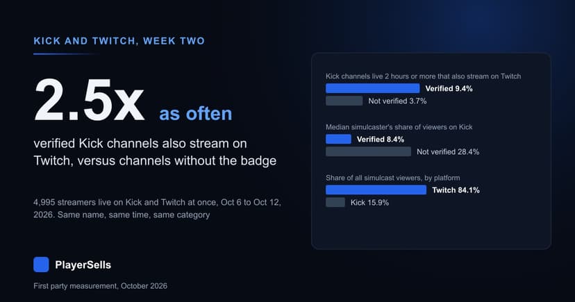
Verified Kick Channels Simulcast 2.5x as Often as Others
4,995 streamers were live on Kick and Twitch at once, Oct 6 to 12, 2026. 9.4% of verified Kick channels simulcast, against 3.7% of others.
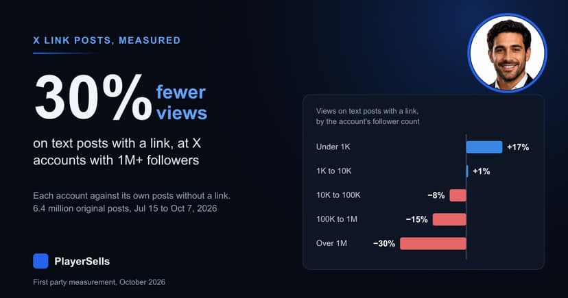
Does X Still Penalize Links? 6.4 Million Posts Measured
Across 6.4 million X posts, text posts with a link drew 10% fewer views than the same account's posts without one, and 30% fewer at 1M+ followers.
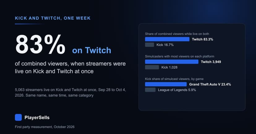
Kick and Twitch Simulcasts: 83% of Viewers Watch on Twitch
5,063 streamers went live on Kick and Twitch at once from Sep 28 to Oct 4, 2026. Twitch drew 83% of their combined viewers and Kick 17%.