

Best Time to Post on X? 1.2 Million Posts Say No Hour Wins
We ran 264 posting-hour tests on 1,198,507 X posts. Zero best hours survived correction. Format beats timing: video lifts reach 34.7 percent.
We ran 264 statistical tests on what hour to post on X, across 1,198,507 original posts captured between 2026-05-29 and 2026-08-27. Twenty eight of those tests found an hour that beat the account's own baseline on views. After Benjamini-Hochberg correction for multiple comparisons, zero survived. Not one. In those same 264 tests, 125 hours that hurt reach survived correction comfortably.
That result is close to the opposite of what the "best time to post on X" genre publishes. Our index of X posts cannot hand you a golden hour, because at a defensible confidence level a golden hour does not exist in our data. It can tell you which hours are reliably bad, and it can tell you that the hour matters far less than what you actually put in the post. Across the thirteen posting factors we tested on the same corpus, hour of day ranked twelfth by effect size. Video ranked first, at more than four times the size of the largest hour effect.
Everything below is measured on the PlayerSells insight engine: 1,198,507 original X posts carrying a view count and the poster's follower count at the moment of publication, 36,074 account-level profiles, and 3,184 pre-computed pattern tests that carry p values, Benjamini-Hochberg q values, bootstrap confidence intervals and per-account win and loss counts. We state the sample size under every table, we name every confound we found, and we flag the two places where two different estimators disagreed with each other rather than quietly publishing the more flattering one.
What exactly did we measure, and on what?
The corpus for this article is 1,198,507 original X posts collected by the PlayerSells crawler between 2026-05-29 and 2026-08-27, a 91 day window. Original means the post is not a retweet, quote or reply: we separate those because a retweet carries someone else's content and would contaminate any question about what you should write. The same crawl also holds 506,448 retweets, 165,805 quotes, 89,933 in-thread posts and 7,692 replies, none of which are used for the format findings here.
Fill rate matters more than row count, so we checked every column before quoting any of it. On the 1,198,507 original posts, all 22 analytic columns we use are 100 percent populated: hour of day in UTC, day of week, character length, word count, media flags, photo count, video count, link flag, hashtag count, mention count, thread flags, bookmark count, engagement, language and posting client. A view count is present on 1,198,379 of them, which is 99.99 percent. No post in the table carries a recorded view count of exactly zero, so filtering on a positive view count and filtering on a non-null view count select exactly the same rows.
Four metrics run through this whole article and it is worth being exact about them. Views is the impression count X reports on the post. Engagement is the sum of likes, retweets, replies and quotes: we verified that definition against 62,111 sampled rows and it held on every one of them. Engagement per view is engagement divided by views, which is the only one of the four that is not inflated by simply having a bigger audience. Bookmarks is counted separately, because bookmarks are not included in the engagement total, and because bookmark behaviour turns out to differ from everything else.
Two independent estimators appear throughout. The first is a direct measurement we compute ourselves from the raw posts: a median of the metric within each bucket. The second is a pre-computed account-paired estimator that compares each account against itself, takes the median across accounts rather than across posts, attaches a bootstrap confidence interval, and applies Benjamini-Hochberg correction across the whole test family. Where the two agree we say so. Where they disagree we show both and explain why, because a disagreement between two reasonable methods is information, not an embarrassment.
If you want to run the equivalent check on a single account rather than read ours, the tweet performance analyzer scores individual posts against the account's own baseline, which is the same normalisation logic described above.
Does the hour you post on X actually matter?
The hour you post changes your median view count by about 7 percent once you control for who is posting, and by about 73 percent if you do not control for it. That gap between 7 and 73 is the entire "best time to post" industry.
Start with the uncontrolled number, because it is the one everybody publishes. Taking all 1,198,379 original posts with a view count and grouping them by UTC hour, the median view count runs from 9,842 at 06:00 UTC to 17,064 at 20:00 UTC. That is a 73.4 percent spread between the best and worst hour. Presented on its own, it looks like an enormous, easily exploited effect, and it is the shape of chart that has been recycled through social media blogs for years.
The problem is that different accounts post at different hours. A million-follower news desk and a thousand-follower hobbyist do not share a schedule, so an hour that happens to attract larger accounts will show a higher median view count for reasons that have nothing to do with the clock. To remove that, we scored every post against its own account's baseline: for each account with at least 20 original posts in the window we computed that account's mean view count, divided every one of its posts by that figure, and then took the median of the resulting ratio within each hour. That leaves 1,085,092 posts and removes account size from the comparison entirely.
Under that control the hour effect collapses. The best hour, 10:00 UTC, scores 0.6114. The worst, 04:00 UTC, scores 0.5701. The ratio between them is 1.0724, a spread of 7.2 percent. Roughly nine tenths of the apparent timing effect was composition: which accounts post when, not what time it is. The independent account-paired estimator lands in the same place, with a views lift running from minus 0.8 percent to minus 7.9 percent across the 24 hours, a range of 7.1 points.
Here is the full account-paired picture across all four metrics. Each figure is the percentage lift relative to the account's own baseline for posts made in that hour.
| Hour (UTC) | Posts tested | Views | Engagement | Engagement per view | Bookmarks | Metrics surviving BH |
|---|---|---|---|---|---|---|
| 00 | 28,842 | -2.7% | -0.2% | +4.0% | -4.8% | 3 of 4 |
| 01 | 29,476 | -2.6% | +0.6% | +4.0% | -4.5% | 3 of 4 |
| 02 | 28,830 | -5.1% | -2.5% | +3.9% | -5.2% | 3 of 4 |
| 03 | 30,540 | -3.6% | -3.6% | +1.2% | -4.3% | 3 of 4 |
| 04 | 24,486 | -7.5% | -5.4% | +4.1% | -6.7% | 4 of 4 |
| 05 | 23,817 | -6.6% | -4.1% | +3.0% | -5.6% | 4 of 4 |
| 06 | 27,358 | -7.9% | -6.0% | +2.1% | -6.6% | 3 of 4 |
| 07 | 29,367 | -6.0% | -4.7% | +2.4% | -6.0% | 4 of 4 |
| 08 | 34,742 | -5.2% | -4.2% | +1.5% | -4.5% | 3 of 4 |
| 09 | 39,559 | -3.3% | -2.5% | +1.2% | -3.6% | 3 of 4 |
| 10 | 41,903 | -2.6% | -2.3% | +1.4% | -3.8% | 3 of 4 |
| 11 | 45,314 | -3.0% | -2.4% | +0.8% | -3.8% | 3 of 4 |
| 12 | 50,060 | -3.1% | -1.2% | +1.4% | -3.8% | 3 of 4 |
| 13 | 55,779 | -3.0% | -1.8% | +1.2% | -4.1% | 2 of 4 |
| 14 | 57,827 | -3.5% | -3.2% | -0.6% | -4.5% | 3 of 4 |
| 15 | 60,172 | -2.3% | -1.7% | +0.4% | -3.3% | 3 of 4 |
| 16 | 58,428 | -2.3% | -2.9% | +1.1% | -3.1% | 3 of 4 |
| 17 | 54,300 | -2.2% | -3.2% | +0.2% | -3.5% | 3 of 4 |
| 18 | 50,230 | -2.4% | -0.7% | +2.1% | -3.1% | 3 of 4 |
| 19 | 46,606 | -0.8% | -0.7% | +1.1% | -3.3% | 1 of 4 |
| 20 | 43,075 | -1.0% | -0.9% | +1.4% | -3.1% | 2 of 4 |
| 21 | 38,351 | -2.5% | +0.1% | +3.8% | -3.3% | 3 of 4 |
| 22 | 33,380 | -3.4% | -1.3% | +3.6% | -3.6% | 3 of 4 |
| 23 | 29,688 | -2.3% | -0.3% | +3.0% | -4.0% | 3 of 4 |
Sample: 24 hourly buckets drawn from the pooled all-accounts peer group, post counts as shown per hour, measured 2026-05-29 to 2026-08-27. Lift is relative to the posting account's own baseline. The final column counts how many of the four metrics survived Benjamini-Hochberg correction at q below 0.05.
Read down the views column and note what is missing: a positive number. Every one of the 24 hours sits below the account's own baseline on views, and the same is true of bookmarks. Only engagement per view puts up positive figures, and it does so in 23 of 24 hours. We treat the absolute sign here with caution, because an account-paired estimator that compares one hour against an account's whole mix can push every individual bucket below the pooled baseline. What is robust is the spread and the ordering, and both say the same thing: the hours differ from each other by single-digit percentages.
Why does no best hour survive statistical correction?
No best hour survives because when you test 24 hours against four metrics across 11 peer groups, you have run 1,056 tests on the hour dimension alone, and at a 5 percent threshold roughly 53 of those will look significant purely by chance. Benjamini-Hochberg correction adjusts for exactly that, and when it is applied every positive hour result on views disappears.
The pattern table we query carries 3,184 rows, each one a single test of one bucket against one metric within one peer group. Of those, 3,144 carry both a p value and a Benjamini-Hochberg q value; the remaining 40 were computed on 2026-08-27, after the last correction pass on 2026-08-26, and we exclude them from every significance count in this article. Applying an uncorrected threshold of p below 0.05 to those 3,144 tests marks 1,631 of them, or 51.9 percent, as significant. Applying the corrected threshold of q below 0.05 marks 1,443, or 45.9 percent. So 188 findings, 11.5 percent of the raw winners, exist only because nobody corrected for how many questions were asked.
That is the aggregate. The hour dimension specifically is far more brutal, and the asymmetry is the story.
| Metric | Hour tests run | Hours with positive lift | Positive and BH significant | Hours with negative lift | Negative and BH significant |
|---|---|---|---|---|---|
| Views | 264 | 28 | 0 | 236 | 125 |
| Bookmarks | 264 | 10 | 0 | 253 | 183 |
| Engagement | 264 | 59 | 5 | 205 | 53 |
| Engagement per view | 264 | 207 | 41 | 57 | 1 |
Sample: 1,056 hour-level tests, being 24 UTC hours across 11 peer groups across 4 metrics, drawn from a pattern table of 3,184 tests computed 2026-08-25 to 2026-08-27 and Benjamini-Hochberg corrected on 2026-08-26. Significance is q below 0.05.
Combine the views and bookmarks rows and the summary is stark. Across 528 hour-level tests on the two reach metrics, 38 hours showed a positive effect and not a single one survived correction, while 308 negative effects did. The data is not silent about hours. It is loudly, repeatedly telling you which hours cost you reach, and saying nothing defensible about which hour gains it.
Engagement per view is the one exception, and it is a real one: 41 of its 207 positive hour effects survive correction. Those cluster in the overnight and late evening UTC hours, with 04:00 at plus 4.1 percent, 00:00 and 01:00 at plus 4.0 percent, and 21:00 at plus 3.8 percent. So there is a defensible statement available about timing, but it is narrow: certain hours are associated with a modestly higher engagement rate among the people who see the post, while costing impressions. We are describing an association across accounts, not a mechanism. Fewer posts compete in those hours, and the accounts and audiences active then differ from the daytime population, so we cannot separate the clock from who is awake.
Which hours are actually worth avoiding?
The hours worth avoiding on our data are roughly 01:00 to 08:00 UTC, and that finding holds in nine of the eleven peer groups we tested. This is the actionable half of the timing question, and it is the half that survives correction.
We split the index into ten follower deciles plus a pooled all-accounts group, then asked for each group which single hour scored best on views and which scored worst. The result is unusually clean.
| Peer group | Median followers | Best hour (UTC) | Best hour lift | Best survives BH? | Worst hour (UTC) | Worst hour lift | Hours BH significant |
|---|---|---|---|---|---|---|---|
| All accounts | mixed | 19 | -0.8% | No | 06 | -7.9% | 22 of 24 |
| Decile 1 | 999 | 19 | +0.3% | No | 02 | -23.4% | 15 of 24 |
| Decile 2 | 9,941 | 10 | -1.9% | No | 01 | -12.9% | 17 of 24 |
| Decile 3 | 9,998 | 15 | +0.5% | No | 04 | -15.7% | 14 of 24 |
| Decile 4 | 95,100 | 20 | -1.0% | No | 05 | -8.8% | 16 of 24 |
| Decile 5 | 98,578 | 19 | +0.2% | No | 05 | -12.3% | 14 of 24 |
| Decile 6 | 615,180 | 19 | -0.2% | No | 06 | -10.5% | 6 of 24 |
| Decile 7 | 787,646 | 00 | -0.9% | No | 13 | -6.1% | 6 of 24 |
| Decile 8 | 1,064,396 | 17 | +1.8% | No | 14 | -4.4% | 4 of 24 |
| Decile 9 | 1,643,302 | 23 | +2.9% | No | 08 | -10.7% | 5 of 24 |
| Decile 10 | 3,724,146 | 19 | +2.5% | No | 06 | -9.0% | 6 of 24 |
Sample: 264 hour-level tests on views, being 24 UTC hours across 11 peer groups, measured 2026-05-29 to 2026-08-27. Median followers are computed from 22,056 accounts that carry a peer group assignment. Significance is Benjamini-Hochberg q below 0.05.
The "best survives BH" column reads No eleven times out of eleven. In every single peer group, from thousand-follower accounts to accounts above three million followers, the top-scoring hour fails correction. Meanwhile the worst hour is significant in every group, and between 4 and 22 individual hours per group are significantly bad. Five of the eleven groups have their worst hour somewhere between 04:00 and 06:00 UTC, and nine of eleven fall in the 01:00 to 08:00 band.
The practical translation is a negative rule rather than a positive one. Do not build a schedule around a golden hour that our data cannot confirm exists. Do avoid the overnight-UTC block if reach is what you want, because that penalty reproduces across every account size we can measure. If you want the equivalent read on a specific handle rather than the population, the best posting time analyzer computes the same hour-by-hour comparison against one account's own history.
Do views and engagement rate ever point at the same hour?
They point in opposite directions. Ranking the 24 UTC hours by views lift and again by engagement-per-view lift produces a rank correlation of minus 0.354. The hours that maximise impressions are, on average, the hours that minimise the rate at which the people who see the post respond to it.
The single clearest illustration is 04:00 UTC. It is the best hour in the entire table for engagement per view, at plus 4.1 percent with a q value of 0.00002. It is also the second worst hour for views, at minus 7.5 percent. One hour, two headline metrics, two opposite verdicts. Any article that names a best hour without naming its metric has hidden this from you.
The disagreement is not limited to those two metrics. Comparing all four rankings across the 24 hours gives a bookmarks-to-engagement-rate correlation of minus 0.476, an engagement-to-engagement-rate correlation of just plus 0.208, and a bookmarks-to-views correlation of plus 0.826. In other words the three volume metrics broadly agree with each other, and the one rate metric disagrees with all of them. That makes sense arithmetically, since views sits in the denominator of engagement per view, but it has a blunt practical consequence: your posting schedule cannot be optimal for reach and for engagement rate at the same time, and you have to decide which one you are actually buying.
We were tempted to extend this into a general law, that everything which buys reach costs engagement rate. We tested it and the data refused. Taking all 88 measured buckets across all thirteen dimensions and correlating views lift against engagement-per-view lift gives plus 0.197, a weak positive, and restricting to the 44 buckets that are significant on both metrics gives plus 0.258. There is no general tradeoff. What is true is narrower: 52 of those 88 buckets, or 59.1 percent, move the two metrics in opposite directions, and among the 44 robust buckets 28, or 63.6 percent, do. Most choices push the two metrics apart, but not all of them, and the hour dimension is simply one of the strongest cases. Media is a counterexample: it lifts both.
Does the day of the week matter more than the hour?
Yes. The gap between the best and worst day of the week is 15.4 points on views, against a maximum of 7.9 points for any hour. Day of week is roughly twice the effect of time of day, and almost nobody optimises for it.
The account-paired, corrected numbers put Sunday at plus 7.2 percent on views and Saturday at plus 4.4 percent, while Wednesday sits at minus 8.2 percent and Tuesday at minus 5.2 percent. Sunday and Saturday are the only two days with a positive views lift. The raw medians agree: Saturday's median post takes 17,038 views against Wednesday's 11,032.
| Day | Posts (raw) | Median views (raw) | Engagement per 100 views (raw) | Views lift (paired) | Engagement lift (paired) | Metrics surviving BH |
|---|---|---|---|---|---|---|
| Sunday | 158,444 | 16,283 | 0.9628 | +7.2% | +8.4% | 3 of 4 |
| Monday | 206,696 | 13,109 | 0.7054 | +1.2% | +1.1% | 4 of 4 |
| Tuesday | 219,813 | 11,278 | 0.6685 | -5.2% | -4.2% | 4 of 4 |
| Wednesday | 174,827 | 11,032 | 0.8438 | -8.2% | -6.8% | 4 of 4 |
| Thursday | 142,121 | 15,667 | 1.0246 | -0.4% | -0.3% | 1 of 4 |
| Friday | 155,237 | 16,402 | 1.0360 | -0.6% | -1.4% | 2 of 4 |
| Saturday | 144,541 | 17,038 | 1.0543 | +4.4% | +4.6% | 4 of 4 |
Sample: 1,201,679 original posts with a view count for the raw columns, and 1,032,779 posts across the seven paired buckets, measured 2026-05-29 to 2026-08-27. Paired lift is relative to the posting account's own baseline. Significance is Benjamini-Hochberg q below 0.05.
There is a supply pattern sitting alongside the performance pattern. Tuesday carries 219,813 original posts in our window and Saturday carries 144,541, so Tuesday runs 52.1 percent more posts. Tuesday's median view count is 33.8 percent lower than Saturday's. The busiest day is the worst-performing day and the quietest is the best. That is an association between how many posts compete and how those posts do, and we are deliberately not calling it a cause: weekend audiences behave differently, the mix of accounts posting on a Saturday differs from a Tuesday, and we cannot separate those from competition volume with this data.
One caution on the weekend result. Our crawl window is 91 days, which covers 13 of each weekday. Day-of-week effects in social data are the classic place where a single large news event can move a whole bucket, and 13 observations per day is not many. The effect is large and BH-significant, and Saturday and Sunday agree with each other, which is reassuring, but we would treat it as a solid signal rather than a settled constant.
Do hashtags really hurt your reach on X?
Hashtags cost you views and cost you nothing measurable in engagement rate, and the real penalty is roughly one seventh the size of the one you have probably read. This is the finding where our two estimators disagreed the most sharply, so we are showing all of it.
The naive measurement is dramatic. Grouping all 1,200,260 original posts with a view count by hashtag count, posts with no hashtag take a median 16,006 views and posts with five or more take a median 5,346. That is a 66.6 percent collapse, and it is the kind of number that ends up as a headline. It is also uncontrolled: hashtag use is not randomly distributed across accounts, and 76.92 percent of all posts in our corpus carry no hashtag at all, so the comparison is heavily shaped by which accounts are in which bucket.
| Hashtags | Posts | Share of corpus | Median views (raw) | Engagement per 100 views (raw) | Views lift (paired) | Engagement-rate lift (paired) | Engagement rate BH significant? |
|---|---|---|---|---|---|---|---|
| 0 | 923,281 | 76.92% | 16,006 | 0.9493 | +12.1% | -1.1% | No, q = 0.20 |
| 1 | 143,237 | 11.93% | 10,055 | 0.6316 | -6.4% | +0.6% | No, q = 0.35 |
| 2 | 60,918 | 5.08% | 8,940 | 0.6579 | -6.2% | +0.2% | No, q = 0.87 |
| 3 to 4 | 49,479 | 4.12% | 6,613 | 0.6259 | -9.2% | +0.5% | No, q = 0.76 |
| 5 or more | 23,345 | 1.94% | 5,346 | 0.7894 | -9.2% | +0.5% | No, q = 0.76 |
Sample: 1,200,260 original posts with a view count for the raw columns, measured 2026-05-29 to 2026-08-27. Paired columns come from 481,920 posts across 7,654 to 9,269 accounts per bucket, and collapse three or more hashtags into one bucket, which is why the last two rows share paired figures. Significance is Benjamini-Hochberg q below 0.05.
The account-paired estimator, which compares each account against itself and weights every account equally, puts the penalty at minus 6.4 percent of views for one hashtag and minus 9.2 percent for three or more. All four of those views buckets clear correction with q values below 0.00001, so the direction is not in doubt. But minus 9.2 percent is a very different claim from minus 66.6 percent, and only the first one is defensible. The uncontrolled figure is mostly telling you that smaller accounts use more hashtags.
The more interesting column is the last one. Not one of the four engagement-per-view buckets survives correction: the q values are 0.20, 0.35, 0.87 and 0.76, and the lifts are between minus 1.1 and plus 0.6 percent. Hashtags change how many people see a post. They do not measurably change how the people who do see it respond. The per-account win and loss counts say the same thing: on engagement rate, the zero-hashtag bucket has 3,755 accounts improving and 3,899 declining, which is as close to a coin flip as this data produces.
Now the disagreement, because it matters. We also computed a within-account hashtag comparison ourselves, pooling posts rather than accounts: every post divided by its own account's mean, then a median per bucket. That estimator inverts the result, scoring the five-or-more bucket 22.3 percent above the no-hashtag bucket. The two methods differ in what they weight. Ours weights every post equally, so accounts that post constantly dominate it; the paired estimator weights every account equally. We report the account-weighted, bootstrap-tested, corrected version as our answer because it is the better-controlled design, and we are telling you the other one exists because publishing only the flattering estimator is how this genre got into trouble in the first place.
What does putting a link in a post cost you?
A link is the most expensive single thing you can add to a post on X, and it is the only choice we measured that loses on both reach and engagement rate at the same time. On the account-paired, corrected estimator a link costs 16.0 percent of views and 35.5 percent of engagement rate.
The raw split is even starker, and this time the control makes it smaller rather than reversing it. Restricting to posts made from an official X client so the posting tool cannot explain the gap, link-free posts take a median 17,779 views and 1.3720 engagements per 100 views, while posts carrying a link take a median 7,791 views and 0.4190 engagements per 100 views. That is 56.2 percent fewer views and a 69.5 percent lower engagement rate, on 761,616 and 238,161 posts respectively.
The format comparison makes the point differently. A post with a link and no media takes a median 6,281 views, which is 28.2 percent of what a video post takes, and an engagement rate of 0.1957 per 100 views against 0.9479 for a plain text post with no link and no media. A link post gets 4.84 times less engagement per view than the same kind of text-only post without the link. Link posts are 14.90 percent of the corpus, so this is not a fringe case.
We are not claiming X suppresses links as a policy, because our data cannot see ranking decisions. What we can say is that across 219,415 link-carrying posts from 11,924 accounts, compared against those same accounts' own link-free posts, the penalty is large, consistent and highly significant on all four metrics. Whether that is a ranking effect, a reader behaviour effect, or the fact that link posts are disproportionately promotional, we cannot separate. For a broader look at how X's ranking machinery is documented to work, our piece on what the open source X algorithm means in practice covers the published side of it.
Mentions behave like a smaller version of the same effect. Posts with no mention run plus 15.9 percent on views, one mention runs minus 9.0 percent, and two or more runs minus 16.6 percent, all four metrics significant in every bucket. Anything that points the reader somewhere else, a link or another account, is associated with lower reach.
Which post formats actually earn bookmarks?
Video earns 13.2 times the bookmark rate of a link post and 4.1 times that of a text-only post. Bookmarks are the least reported metric on X, and they behave differently enough from likes that they are worth tracking separately.
Bookmarks are not included in the engagement total we use, which we verified directly, so every bookmark figure here is independent of the engagement figures elsewhere in this article. That independence is useful, because a bookmark is a much stronger signal than a like: it is a reader deciding they want the post later.
| Format | Posts | Share of corpus | Median views | Bookmarks per 1,000 views | Engagement per 100 views | Mean bookmarks |
|---|---|---|---|---|---|---|
| Video | 299,018 | 24.88% | 22,242 | 0.396 | 0.9941 | 345.8 |
| Photo | 516,781 | 43.00% | 14,374 | 0.227 | 1.2142 | 144.2 |
| Text only | 206,791 | 17.21% | 13,399 | 0.096 | 0.9479 | 90.2 |
| Link, no media | 179,089 | 14.90% | 6,281 | 0.030 | 0.1957 | 34.0 |
Sample: 1,201,679 original posts with a view count, measured 2026-05-29 to 2026-08-27. Formats are mutually exclusive and assigned in that order, so a post with both a video and a photo counts as video. Medians are computed per post, so the mean bookmark column is shown only to illustrate how far the mean sits from the median on a skewed metric.
Three things fall out of that table. Video takes the highest reach with a median 22,242 views, and by far the highest bookmark rate. Photo takes the highest engagement rate at 1.2142 per 100 views, ahead of video's 0.9941, so if replies and likes are what you want, a photo does better than a video on our data. And a link with no media is last on every column by a wide margin.
The account-paired estimator confirms the direction with different magnitudes. Video runs plus 34.7 percent on views and plus 90.0 percent on bookmarks against posts without video, both significant. Any media at all runs plus 30.9 percent on views, plus 89.8 percent on engagement and plus 89.0 percent on bookmarks. Media is the largest positive effect in the entire study, and unlike most of the others it lifts reach and engagement rate together, which is why it is the exception to the general pattern of metrics disagreeing.
Photo count matters within media. Two or three photos runs plus 15.4 percent on views while a single photo runs minus 11.4 percent, both significant on all four metrics. Four or more photos runs plus 2.4 percent but survives correction on only one of the four metrics, so we report it as not established rather than as a finding.
Threads are a smaller but consistent positive. Thread roots are 3.9 percent of originals, 47,414 posts, and take a median 19,413 views against 13,670 for non-roots, a 42.0 percent difference, with a 78.6 percent higher bookmark rate. The paired estimator agrees in direction at plus 6.5 percent on views and plus 13.6 percent on engagement rate, significant on all four metrics. Two independent methods agreeing on direction while disagreeing on size is the normal, healthy outcome; we quote the smaller controlled figure when we need one number.
How long should a post on X be?
Short posts win on engagement rate and that is the only length result both our estimators agree on. Whether short posts win or lose on reach is genuinely unresolved in our data, and we are not going to pretend otherwise.
Measured directly, posts under 71 characters lead on everything: a median 18,858 views, 1.6502 engagements per 100 views and 0.308 bookmarks per 1,000 views. The 141 to 280 character band is the worst on views and engagement rate. The pattern looks like a clean case for brevity.
| Length band | Posts | Share of corpus | Median characters | Median views | Engagement per 100 views | Bookmarks per 1,000 views | Share carrying a link |
|---|---|---|---|---|---|---|---|
| Under 71 characters | 286,530 | 23.84% | 43 | 18,858 | 1.6502 | 0.308 | 9.5% |
| 71 to 140 | 337,293 | 28.07% | 104 | 14,138 | 0.6713 | 0.149 | 35.3% |
| 141 to 280 | 362,623 | 30.18% | 196 | 11,813 | 0.6560 | 0.157 | 40.5% |
| 281 or more | 215,233 | 17.91% | 381 | 12,202 | 0.8765 | 0.226 | 30.0% |
Sample: 1,201,679 original posts with a view count, measured 2026-05-29 to 2026-08-27. The final column is the share of posts in that band carrying at least one link, included because it is the main confound in this table.
That final column is the reason to be careful. Posts under 71 characters carry a link only 9.5 percent of the time, against 35.3 and 40.5 percent for the two middle bands. Since a link is the single most damaging feature we measured, a large part of the short-post advantage in this table is simply that short posts rarely contain links. The confound runs the other way from what you might expect on account size: mean followers is actually lowest in the shortest band at 1,271,507, so this is not big accounts dragging the short bucket up.
The account-paired estimator, which controls for the account but not for the link, disagrees on two of the three metrics. It puts short posts at minus 7.1 percent on views and minus 10.8 percent on bookmarks, but plus 9.0 percent on engagement rate. It puts very long posts at plus 10.4 percent on views and plus 19.1 percent on bookmarks. So the raw table and the paired estimator agree only on engagement rate, where both say short posts do better. On reach and bookmarks they point opposite ways, and we do not have a clean way to arbitrate between them with this data. The honest summary: brevity helps the response rate among people who see your post, and its effect on how many people see it is unresolved.
There is one length-adjacent finding that is unambiguous, and it comes from an unexpected place. X assigns the language codes qme and zxx to posts with no meaningful text, and our index holds 12,276 and 38,568 of them respectively. The qme posts are 95.0 percent media with a median of 28 characters; zxx posts are 81.3 percent media with a median of 23 characters. Those captionless media posts take a median 3.1417 engagements per 100 views, against 0.9268 for English-language posts, which is 3.39 times higher. The paired estimator agrees, putting qme at plus 43.7 percent engagement rate on all four metrics significant. They pay for it in reach, at minus 6.4 percent views. A picture with almost no caption is the highest engagement-rate format on X that we can measure.
How often should you post, and do scheduling tools hurt?
Posting again within an hour of your last post costs about 12.5 percent of the second post's views and does not measurably reduce its engagement rate. Scheduling tools cost you nothing in reach once you account for links, but posts sent through them show roughly half the engagement rate of posts sent from an official client.
Take frequency first. The account-paired estimator measures the gap since that account's previous post. Posting within an hour runs minus 12.5 percent on views, minus 13.0 percent on engagement and minus 10.2 percent on bookmarks, all significant, across 395,975 posts from 16,198 accounts. Waiting more than 24 hours runs plus 9.0 percent on views. The 1 to 6 hour bucket is a clean null: zero of its four metrics survive correction, with lifts between 0.0 and plus 0.8 percent.
The important detail is that the engagement-rate column barely moves. Posting within an hour runs plus 1.7 percent on engagement per view, and waiting over 24 hours runs minus 2.0 percent. So rapid posting reduces how many people see each post without making those people less responsive. If your goal is total reach across a day, posting more often spreads a smaller multiple across more posts; if your goal is one post landing as hard as possible, spacing helps it.
At the account level the same question looks far more dramatic and is far less trustworthy. Across 33,188 accounts, median engagement per 100 views falls from 1.3238 for accounts posting one to three times a day to 0.2048 for accounts posting twelve or more times a day, a 6.5 fold drop. But median follower count across those same bands rises from 97,400 to 4,787,032, a 49 fold increase. The high-frequency group is essentially large news and media operations, and we cannot separate posting frequency from account size in that comparison. The 12-or-more band holds only 143 accounts. We report it as a description of what high-frequency accounts look like, not as evidence about what would happen if you posted more.
Now the posting client, which produced the cleanest confound in the study. Uncontrolled, posts from third-party tools look 19.3 percent worse on views, with a median of 11,682 against 14,478 for official clients. But third-party posts carry a link 59.2 percent of the time against 23.8 percent for official ones, so the comparison is measuring links as much as tools. Splitting on the link flag resolves it.
| Posting client | Carries a link | Posts | Median views | Engagement per 100 views |
|---|---|---|---|---|
| Official X client | No | 761,616 | 17,779 | 1.3720 |
| Third-party tool | No | 82,426 | 21,606 | 0.5838 |
| Official X client | Yes | 238,161 | 7,791 | 0.4190 |
| Third-party tool | Yes | 119,476 | 7,916 | 0.1867 |
Sample: 1,201,679 original posts with a view count, measured 2026-05-29 to 2026-08-27. Official X client covers the iPhone, Android, iPad, Web App, Web Client, Media Studio and TweetDeck source labels, which together are 83.20 percent of the corpus. Third-party covers everything else, led by Sprout Social, Buffer, Hootsuite and Sprinklr.
The reach penalty for scheduling tools disappears completely under the control. On link-free posts, third-party tools actually take a higher median view count, 21,606 against 17,779. On link posts the two are within 1.6 percent of each other. Whatever people believe about X throttling scheduled posts, we cannot find it in impressions.
The engagement-rate penalty does survive, in both strata and at a similar size: 2.35 times lower on link-free posts and 2.24 times lower on link posts. That consistency across strata is what makes it credible as a pattern. It is still not evidence that the tool causes it. Accounts that route posts through Sprinklr or Buffer are running scheduled brand and publisher content, which is different content written for a different purpose, and our data cannot separate the tool from what gets sent through it.
Does any of this change with account size?
The timing conclusion holds at every account size we can measure, and accounts show almost no agreement with each other about which hour is theirs. The most common peak hour across 33,188 accounts covers just 6.04 percent of them.
Our account table computes, for each account with enough history, the UTC hour in which that account's own posts perform best. If accounts genuinely shared a best hour, one hour would dominate that distribution. Instead the top hour, 14:00 UTC, holds 2,003 of 33,188 accounts, or 6.04 percent. A perfectly uniform spread across 24 hours would give 4.17 percent. The distribution is barely distinguishable from flat, with the next four hours at 5.90, 5.81, 5.72 and 5.18 percent. There is no shared clock.
The peer group table earlier in this article makes the same point from the other direction. The best hour differs by decile, landing on 19:00 UTC in five groups but on 10:00, 15:00, 20:00, 00:00, 17:00 and 23:00 in the others, and none of them are significant. The bad hours, by contrast, converge: nine of eleven groups have their worst hour between 01:00 and 08:00 UTC.
The format findings are where size does change things, though in magnitude rather than direction. The smallest decile, with a median of 999 followers, shows by far the largest hour penalties, with its worst hour at minus 23.4 percent against minus 9.0 percent for the largest decile. Smaller accounts have more variable per-post outcomes, so their measured effects are bigger and noisier. If you are working at a few thousand followers, the sensible reading is that your individual posts swing much more than a large account's do, which makes any single post a poor guide to anything. Our follower count benchmarks across 17 million accounts covers where a given size actually sits, and the follower percentile rank tool places one handle against that distribution.
What this data cannot tell you
This study measures association across accounts that our crawler indexed. It does not measure causation, and there are four specific limits worth stating plainly before you act on any number above.
The first is selection. Our index is not a random sample of X. Looking at the follower deciles, median follower counts cluster hard at 999, 9,941, 9,998, 95,100 and 98,578, which is the fingerprint of a crawler seeded around the round 1,000, 10,000 and 100,000 follower thresholds. These are deciles of our index, not of X. They work as a coarse small-versus-large contrast and they should not be read as population quantiles. The corpus also skews large overall: mean follower count at the time of posting runs above one million in every length band, so this is a study of accounts with meaningful audiences, not of new accounts.
The second is that we cannot see the algorithm. We observe views, engagement and bookmarks after the fact. We cannot distinguish a ranking decision from a reader decision. When we report that link posts take 56.2 percent fewer views, that is compatible with X down-ranking links, with readers scrolling past link posts, and with link posts simply being more promotional and less interesting. We have no way to separate those three with this data, and anyone who tells you they can from public metrics alone is guessing.
The third is one derived column we do not trust for group comparison, and we would rather say so than quietly avoid it. The corpus carries a viral multiple field, populated on 1,144,387 of the original posts. It is normalised per account, and the consequence is that its median is pinned to exactly 1.0000 in every group we tested, including all 24 hourly buckets. A statistic that returns the same value for every group cannot discriminate between groups, so we never quote a raw group median of it anywhere in this article. Its distribution is also extreme: the 25th percentile is 0.5000, the 90th is 6.0000, the 99th is 177.913, and the mean is 34.5070, which is 34 times the median. Any article quoting a mean multiple as a typical outcome is describing a handful of outliers.
The fourth is the window. Ninety one days, 2026-05-29 to 2026-08-27, covers 13 instances of each weekday and one northern-hemisphere summer. Seasonal effects, a platform ranking change, or a single very large news event could move a day-of-week or hour bucket, and we would not be able to tell from inside this window. The crawler is also live and continuously adding posts: the original count moved from 1,198,507 to 1,204,149 during the day we ran these queries, which is why every table above states its own sample size rather than relying on one global figure.
Two further honest notes. Our account-level table covers 36,074 accounts, but the peer group and view percentile fields are populated on only 22,056 of them, or 61.1 percent, so any size-segmented figure rests on that smaller set. And we ran two different within-account estimators on hashtags and on length, and they disagreed. We have shown both and explained the weighting difference rather than picking one, because the disagreement is a real feature of the data and hiding it would make this article less useful, not more.
Questions and answers
What is the best time to post on X in 2026?
Our data does not support naming one. Across 264 hour-level tests on views, drawn from 1,198,507 original X posts collected between 2026-05-29 and 2026-08-27, 28 hours showed a positive effect and zero survived Benjamini-Hochberg correction for multiple comparisons. The same is true for bookmarks. What does survive is the negative side: 125 hours significantly reduced views. The defensible advice is to avoid roughly 01:00 to 08:00 UTC rather than to chase a specific golden hour.
Does posting time matter at all on X?
It matters by about 7 percent, not by the 73 percent that uncontrolled charts imply. Measuring 1,085,092 X posts against each posting account's own baseline, the best UTC hour scored 0.6114 and the worst 0.5701, a 7.2 percent spread. Measured without that control, median views ranged from 9,842 to 17,064 across hours, a 73.4 percent spread. The difference between those two numbers is composition: which accounts post at which hours.
Do hashtags hurt reach on X?
Yes for reach, no for engagement rate, and by less than commonly claimed. On an account-paired, Benjamini-Hochberg corrected comparison across 481,920 X posts, one hashtag cost 6.4 percent of views and three or more cost 9.2 percent. All four engagement-per-view buckets failed correction, with q values of 0.20, 0.35, 0.87 and 0.76. The uncontrolled figure, a 66.6 percent drop in median views, is roughly seven times the controlled penalty and mostly reflects that smaller accounts use more hashtags.
How many times a day should you post on X?
Our cleanest measurement is about spacing rather than a daily count. Across 395,975 X posts from 16,198 accounts, posting again within an hour of your previous post cost 12.5 percent of the new post's views, while waiting more than 24 hours gained 9.0 percent. The 1 to 6 hour gap was a clean null, with none of its four metrics surviving correction. Engagement rate barely moved in any bucket, so rapid posting reduces how many people see each post without making them less responsive.
What makes a post go viral on X?
Format explains far more than timing. Ranking all thirteen factors we tested on 1,198,507 X posts by the size of their Benjamini-Hochberg significant effect on views, video came first at 34.7 percent, any media second at 30.9 percent and links fourth at 23.2 percent, while hour of day ranked twelfth at 7.9 percent. We would avoid the word viral entirely: our viral multiple field has a 99th percentile of 177.913 against a median of 1.0000, so outlier reach is a different phenomenon from typical reach.
Does day of week matter more than time of day on X?
Yes, by roughly a factor of two. Across 1,032,779 X posts measured against their accounts' own baselines between 2026-05-29 and 2026-08-27, Sunday ran plus 7.2 percent on views and Wednesday minus 8.2 percent, a 15.4 point spread. The maximum spread for any hour of day on the same corpus was 7.9 points. Saturday and Sunday were the only two days with a positive views lift, and both cleared correction.
Do links reduce your reach on X?
Links are the most costly single element we measured. On an account-paired corrected comparison across 219,415 link-carrying X posts from 11,924 accounts, a link cost 16.0 percent of views and 35.5 percent of engagement rate. Restricting to official X clients so the posting tool cannot explain it, link posts took a median 7,791 views against 17,779 for link-free posts. We cannot say whether that is ranking, reader behaviour, or the promotional nature of link posts.
Do scheduling tools like Buffer or Hootsuite hurt X performance?
Not on reach. Once you split on whether the post carries a link, third-party tools take a higher median view count than official clients on link-free posts, 21,606 against 17,779 across 82,426 and 761,616 posts. Engagement rate is a different story: third-party posts show roughly 2.3 times lower engagement per view in both the link and link-free strata. That gap is consistent, but scheduled posts are also different content written for different purposes, so we cannot attribute it to the tool.
Are bookmarks worth tracking on X?
Bookmarks behave differently enough to be worth watching separately, and they are excluded from the engagement total, which we verified on 62,111 sampled posts. Across 1,201,679 X posts, video took 0.396 bookmarks per 1,000 views against 0.030 for a link post, a 13.2 fold gap, and thread roots took 0.334 against 0.187 for single posts. Bookmark rankings across the 24 hours correlate at minus 0.476 with engagement-rate rankings, so bookmarks and likes are not measuring the same behaviour.
Where to start
If you take one thing from 1,198,507 measured X posts, make it this: stop tuning your posting hour and start auditing your post format. The hour of day was the twelfth largest of the thirteen factors we tested, and it was the only one whose best-performing bucket failed statistical correction in all eleven account-size groups. Meanwhile video, media, links and mentions each moved views by between 15 and 35 percent, and every one of those effects survived correction.
The concrete first step is to count what share of your last hundred posts carry a link and what share carry no media. Those are the two levers with the largest measured effects in this entire study, and both are decided before you think about when to hit send. Then check your engagement rate against comparable accounts with our X engagement rate calculator, score a specific post against your own history with the X algorithm score checker, and if your reach has dropped in a way none of the above explains, rule out the boring cause first with the search ban and shadowban check.
For context on whether your account is growing or quietly shrinking, our analysis of 6 million daily snapshots across platforms is the companion piece to this one, and reading an X account's real history covers the same forensic approach applied to a single handle. You can browse the indexed accounts behind these numbers in the X accounts directory, see the rest of our measured work in the insights hub, or look at what accounts with these posting profiles actually change hands for on the marketplace.
Free tools for this topic

Published by the PlayerSells editorial team. Data comes from PlayerSells marketplace records and our own crawlers. About PlayerSells · Editorial policy
Related Articles
Continue learning with these related guides.

Telegram Channel Benchmarks 2026: View Rates, Size, and Growth from 2.4 Million Channels
Telegram view rate benchmarks from 2.4 million indexed channels: 31.3% median at 1K-5K subscribers, 3.3% above 500K, plus 52-day growth by category.

Most Social Accounts Are Shrinking: What 6 Million Daily Snapshots Reveal About Follower Decay
We tracked 6.1 million daily snapshots for 52 days: 63.3% of X accounts and 62.2% of Telegram channels shrank. What follower decay does to price.
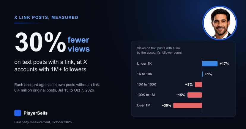
Does X Still Penalize Links? 6.4 Million Posts Measured
Across 6.4 million X posts, text posts with a link drew 10% fewer views than the same account's posts without one, and 30% fewer at 1M+ followers.